
By Jim Lewis, CEO Enhanced Retail Solutions LLC
Last week we talked about the benefit of creating dashboards that provide actionable insights. In Part 2, we are going to show that action in real world use.
Visiting Stores
This week I had the pleasure of touring stores in the Mid-West. Visiting stores was something I really enjoyed in my buying days. It’s where you could see if what you had envisioned in terms of the assortment and presentation was working. You could talk to associates and customers and get live feedback. Because we all spend most of the time in front of the computer, we can easily lose that perspective.
Preparing for store visits 20 years ago required a lot of up-front work. You had to pull and print reports from systems that weren’t that sophisticated. Just filtering at store level took a lot of patience. I would put together a binder that had anything I might need and lug it from store to store. Welcome to the 21st century, where everything you need is on your phone (or thankfully for my poor eyesight, an iPad).
Curated Dashboards
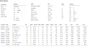
This trip was the perfect opportunity to test out some of the dashboards we created. Now, standing in from of a merchandise presentation I could just enter a store number and get all the statistics I need. I could answer questions on the fly. Besides the high-level performance KPI’s and YoY comparisons, I had curated sections on the dashboard:
- The store’s best-selling items, colors, and sizes.
- Inventory by SKU.
- Different rates of sale based on time (4 weeks, 8 weeks, etc.).
- Items consistently out of stock.
- How the store ranked against nearby stores.
- Commonly bought together items.
It provided a roadmap of how items perform in that store and what action might be needed to make it better. One thing that I did not have but really wanted was how many units each customer buys of a particular product. For example, does she just buy 1 bath towel or 2? That helps with figuring out how to set minimum quantities by sku. I’m sure the retailer could get that statistic since they have the actual transactions by customer.
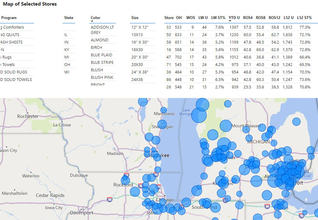
Quickly drill down to store level performance
Having an interactive map also proved valuable. You could select an item, then tie the size of a bubble with the sales quantity. Stores with a big circle were better than one’s with smaller circles.
The trip was a reminder of how technology can have a big impact on the business- finding opportunities we wouldn’t normally come across. I’m not about to say that being a buyer now is easier than it was in my day, but getting answers to management sure is.
For more information about how ERS can help you visualize your business, contact us.
Comments are closed