
By Jim Lewis, CEO Enhanced Retail Solutions LLC
Even the best inventory planners suffer from retail amnesia. The level of amnesia depends on how many products there are and how often new ones are launched. Inevitably, the question arises- how does the performance of this new product compare to ones from the past?
So long as you have kept your weekly data (shame on you if you don’t have at least 3-4 years at this point) it isn’t a hard question to answer. But unlike the solar eclipse which you should never look at directly, tracking performance requires your full ocular capacity.
Step 1: Determine an appropriate time frame.
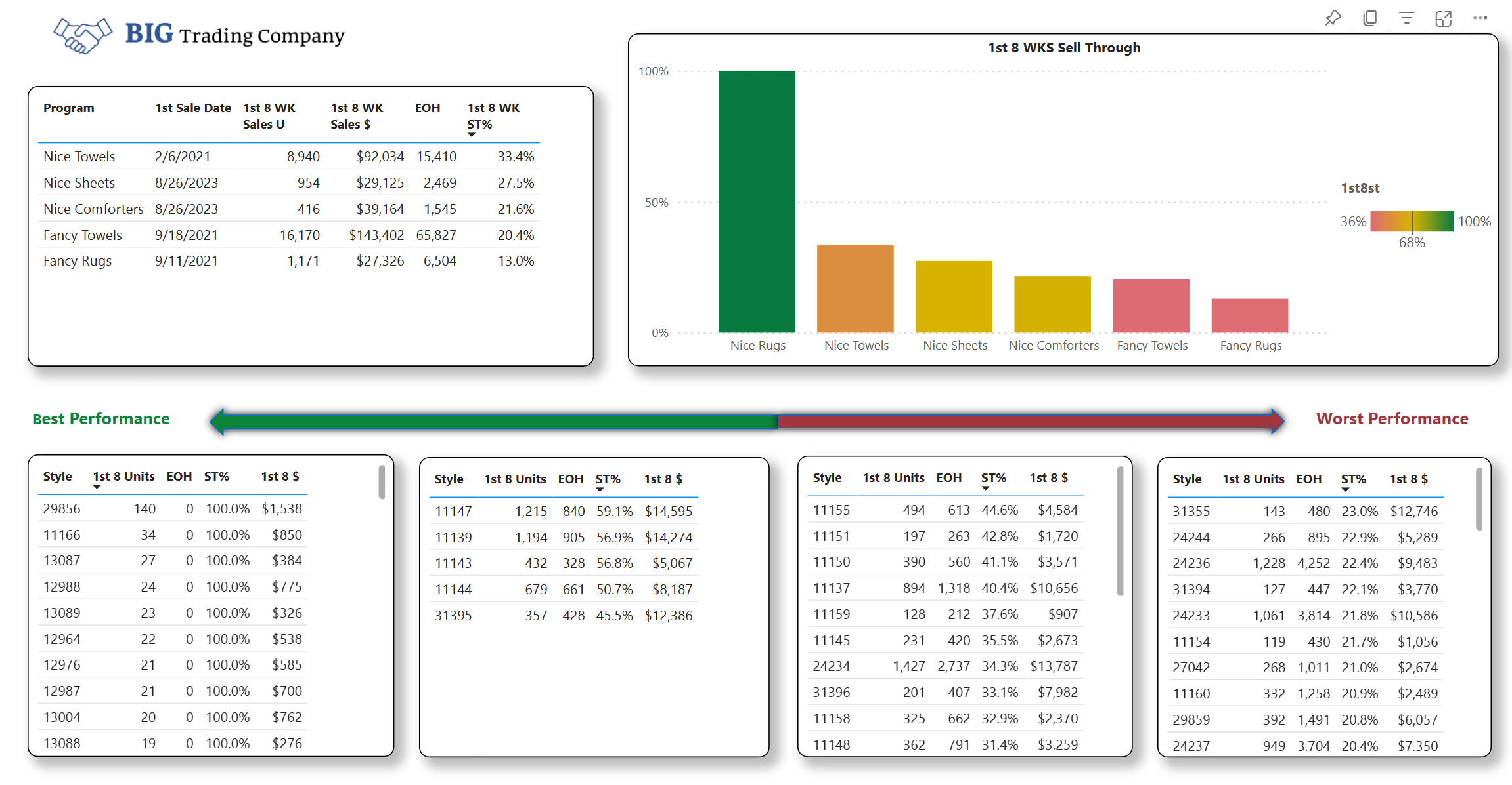
How long does it take to determine whether a product is good or bad? While it can be different by retailer, in general we use 8 weeks. We are not talking about specific dates. Regardless of when a product launched, we can study the first 8 weeks for any product launched at any time.
Step 2: Pick the KPI’s.
Depending on your strategy and philosophy, pick the statistics that you want to compare. Sell through, revenue, unit volume, profit dollars, etc. You may want to consider units or dollars per store- because this levels the playing field regardless of store count.
Item performance across time
Step 3: Line up the data.
Sort your data based on the KPI’s you selected and then rank or score them from best to worst. You may want to add conditions to get the most relevant results. For example, if you want sell through to be your key metric you may want it to have sold a minimum number of units or dollars. Analyze based on different attributes to get the most out of the analysis. Color, size, product material, etc., can all provide clues to why something performs the way it does.
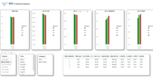
POS report integrated with Census Demographics
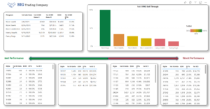
Step 4: Visualize the data.
Since you could be looking at a significant amount of data, think about a way to easily digest the information. We like quartiles. Create 4 boxes, 2 for top performances and 2 for poor performances. You can quickly see which items worked and which didn’t regardless of when they were launched. You can also see if there is any common factor in the top or bottom boxes. Maybe they were all a certain color or fabrication, etc. Maybe geography played a role.
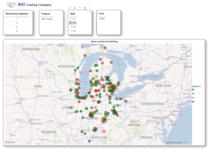
Store performance ranking with map
Step 5: Take action.
This is the most important step because it’s all for naught if you don’t do anything with the data. While you may not be able to fix today’s problem, you can prevent a similar thing from happening in the future. Share the data with the design team or other parties who have a hand in product creation. If you have store level data, spend the time determining the top and bottom stores within each quartile’s performance to see if the same store shows up time after time.
Ranking products provides many benefits including optimizing the assortment mix, determining the optimal time and quantity to ship different types of products and reduce markdowns by not repeating products that fell in the 3rd and 4th quartiles.
For help in putting together an analysis like this, contact us.
Comments are closed